1
2
3
4
5
6
7
8
9
10
11
12
13
14
15
16
17
18
19
20
21
22
23
24
25
26
27
28
29
30
31
32
33
34
35
36
37
38
39
40
41
42
43
44
45
46
47
48
49
50
51
52
53
54
55
56
57
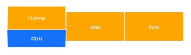
| body{
margin: 0px;
padding: 0px;
}
nav{
width: 615px;
margin: 50px auto;
background-color: #efefef;
}
nav:after{
display: block;
clear:both;
overflow: hidden;
content: "";
}
nav .item{
width: 200px;
height: 100px;
margin-right: 5px;
float: left;
perspective: 6000px;
}
nav .item a{
display: block;
height: 100px;
text-decoration: none;
transition: all .5s;
transform-style: preserve-3d;
}
nav .item a p{
height: 100px;
margin: 0;
line-height: 100px;
font-size: 20px;
font-family: "Microsoft Yahei";
text-align: center;
color: #fff;
border-radius:2px;
transition: all .5s;
}
nav .item a p:first-child{
background-color: orange;
transform: translateZ(50px) ;
}
nav .item a p:last-child{
background-color: #1571fa;
transform: translateZ(50px) rotateX(-90deg);
margin-top: -50px;
}
nav .item a:hover{
transform: rotateX(90deg);
}
nav .item a:hover p:last-child{
margin-top: 0px;
transform: translateZ(0px) rotateX(-90deg);
}
|
 CSS display属性
 Microsoft Edge访问Google
